My Favourite and Arguably the Best Book Covers of 2024
- Dayna Watson

- Dec 17, 2024
- 5 min read
Updated: Dec 28, 2024
Okay, every single news outlet from the New York Times to Literary Hub have jumped on this bandwagon. It seems they collectively chose this week to list the Best Book Covers of 2024 based on their opinions. So, I thought: Why not? I'll join in too! Partially, because I don't agree with all their choices. And honestly because they include few genre and independent works!
So, in no particular order, here are some of the 2024 cover artworks that I've either adored, admired, or completely obsessed over. . . And a bunch at the end when I ran out of time to type them up. Sorry!
(Though, quickly, as a side note...The domination of Macmillan is kind of scary....)
(Side, side note: No I'm not including my own designs! Can't have that bias!!)

Pay the Piper, by George A. Romero and Daniel Kraus
Published by Titan Books
Designed by Evangelline Gallagher
This book cover, to me, is exceptional. Really. Perfectly toned to the deap sea cosmic horror genre. (Always love me some Lovecraftian!). Fantastic imagery. Eye candy colour palette. I'm here for this new era of border-framework composition (as you'll see below haha). And this book cover manages to both throwback to nostalgic pulp horror while elevating it for the modern taste palette. I'm keeping a very close eye on Evangeline's slate of work. She's a star!

The Familiar, by Leigh Bardugo
Published by Flatironbooks, Macmillan
Designed by Jim Tierney and Emma Pidsley
I 'gagged' when I saw this book cover release. It's beyond gorgeous. A piece of art that feels like it's always existed. From its exquisite use of typography to its macabre ambience, when I think gothic and books that should be sitting amongst Anne Rice, this is what I imagine.

What Feasts at Night (Sword Soldier #2), by T. Kingfisher (Ursula Vernon)
Published by Tor Books Nightfire, Pan Macmillan, Macmillan
Designed by Christina Mrozik
What Moves the Dead (2022) is still one of my all time favourite book covers. It's so beautifully horrific and the sequel holds up! Christina's artwork is an exceptional piece once again that beautifully encaptures the rotting horror of the novel. Sadly, this cover edition doesn't seem widely available which is criminal!

Martyr!, by Kveh Askbar
Published by Penguin Random House
Designed by Linda Huang
I know nothing about this book, and this cover doesn't give much away besides a vibe. But what a vibe! It is striking. Demands your attention. Entirely unique while throwing back to the old-school design theory of Paul Bacon and his "Big Book Look" theory, and with great respect. A brilliant example of tip-top composition use and block colour.

Intermezzo, by Sally Rooney
Published by Farrar, Straus and Giroux Macmillan
Designed by Kishan Rajani
In contrast to Martyr!, Kishan takes Paul Bacon's theory and inverts it so her copy (text) borders and pushes forward her illustration. It is a stunning example of "every element" intentionally placed. And, despite its masculine style, the end result is undeniable beauty. So much I second glance whenever I see this cover in print in stores.

Middle of the Night, by Riley Sager
Published by Dutton, Penguin Random House
Designed by Christopher Forest and Alberto Ortega
Every book of Riley Sager's has featured a badass book cover, The Only One Left and Final Girls being two of my all time favourites, and this one is no exception. Similar to Pay the Piper and The Familiar, designer Christopher knew exactly what he was doing when he enlisted illustrator Alberto. This book cover aces its genre codes, and that green is just dreamy. (Or nightmarey?). But best of all? It's recognisable as a "Riley Sager" book. It's rare now a days that authors have a distinct and unique visual brand across their novels and I am HERE FOR IT!

The Ministry of Time, by Kaliane Bradley
Published by Hodder & Stoughton, Hachette
Designed by Andrew Footit
Talking about genre codes and established visual branding for authors--Who comes to mind looking at this? Douglas Adams by chance? Yeah, that's no error or coincidence. When a book promotes such genre hooks as "time travel romance, spy thriller, and workplace comedy", you are very aware of whose tree you're barking up. And I have no qualm about it. Even if it is kind of hilarious. Why? Because no edition of Adams' books actually has this style of artwork. Instead, it was Eoin Colfer's final edition to the series that actually established the brand, designed by the one and only Larry Rostant. (And maybe the film had something to do with it?).
Footit on the other hand is primarily a designer and typographist whose distinct style works brilliantly within this genre, offering a respectful nod, while ensuring evolution. I personally love its balance of typography and its colour palette. It all promotes that beloved retro feel we adore.
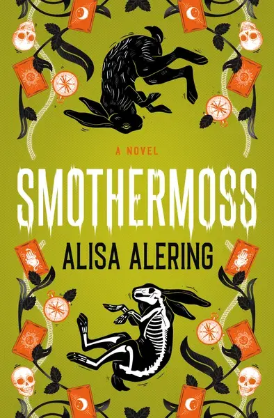
Smothermoss, by Alisa Alering
Published by Titan Books
Designed by Beth Steidle
This cover is just delightful and visual candy to the eye. Everything about it feels intentional with clear creative vision, well executed. It's not overly complex or busy, and instead uses what elements it desires to its advantage, ensuring a crystal narrative.

Knife, by Salman Rushdie
Published by Penguin Random House
Designed by Arsh Raziuddin
People often tout less is more and this is a perfect example of why. With only a simple design of a line and shadow, Arsh has managed to encapture a violent action in a most deceptive, even chic, fashion. But there is no mistaking it. Bedded in sandy tones often associated with innocence and freedom, Arsh further taken this action and undercut its aggression. That may be an odd choice. But focus on the tagline: Meditations After an Attempted Murder.
Arsh aced the brief and I agree wholeheartedly with the New York Times assessment, calling the creative direction as defiant as its author.

The Southern Reach Series (10th Anniversary Redesign), by Jeff VanderMeer
Published by Picador, Pan Macmillan...Macmillan
Designed by Pablo Delcan
I must admit, as book covers, I don't believe THIS variation of Delcan's work is the most effective. Given there are alternative formats of these artworks, I'm must not be the only one of this opinion and I do prefer the alternative option for print being this >

HOWEVER, as posters, and as artwork in general, the original designs ARE in deed "works of art". Stunningly unique. Almost grotesquely beautiful. And, while I haven't read the series (yet!), based off my memory of the movie, this is another example of a brief perfectly executed.

The Naming Song, by Jedediah Berry
Published by Tor Books, Pan Macmillan, Macmillan...
Designed by Will Staehle
Stahle doesn't reinvent the wheel with this bookcover or even offer a unique perspective on well-tried elements. What he does do is pull together various popular themes from recent years: the gold foiled serif title, the gradient background, silhouettes, and photo composite concept. And blends them together in a dynamic cover that is both striking and nostalgic in equal measures. It creates a humble famarility that refuses to be ignored.

Horror Movie, by Paul Tremblay
Published by William Morrow & Company, HarperCollins, News Corp
Designed by **I CAN'T FIND THEM. KNOW? PLEASE TELL ME!*
Okay, is this book cover unique? No. Like many mentioned, this design builds on a prior established genre code and visual language. BUT it executes so beautifully. I also think it's a fantastic creative direction given the title of the book. Nothing shouts Horror Movie more than a killer kid silhouetted by blood red. Perfection. It's disappointing this wasn't the main run!
OTHER FAVOURITES
James by Percival Everett, designed by Emily Mahon; The Dead Take the A Train by Cassandra Khaw and Richard Kadrey, designed by James Jirat Patrdoon; The House of Last Resort by Christopher Golden, designed by **I CAN'T FIND THEM. KNOW? PLEASE TELL ME!* ; Come & Get It by Killey Reid, designed by Vi-An Nguyen ; Private Equity by Carrie Sun, designed by ; The White Guy Dies First, designed by Maeve Norton
Did I mention your favourites? Disagree with any of my comments? Let me know below :)


Comments